branding through Identity
The client: A family office built around intentional investment, with a strong belief in community, connection, and the power of bringing meaningful projects together. Focusing on long-term relationships, shared purpose, and creating a positive impact through every investment.
The Brio: For this project, we developed a complete rebrand and brand identity, shifting the family office towards a more personal, human perspective. Rooted in warm earth tones and inspired by the family’s heritage, every element of the identity was designed to express their core values and create a sense of connection.
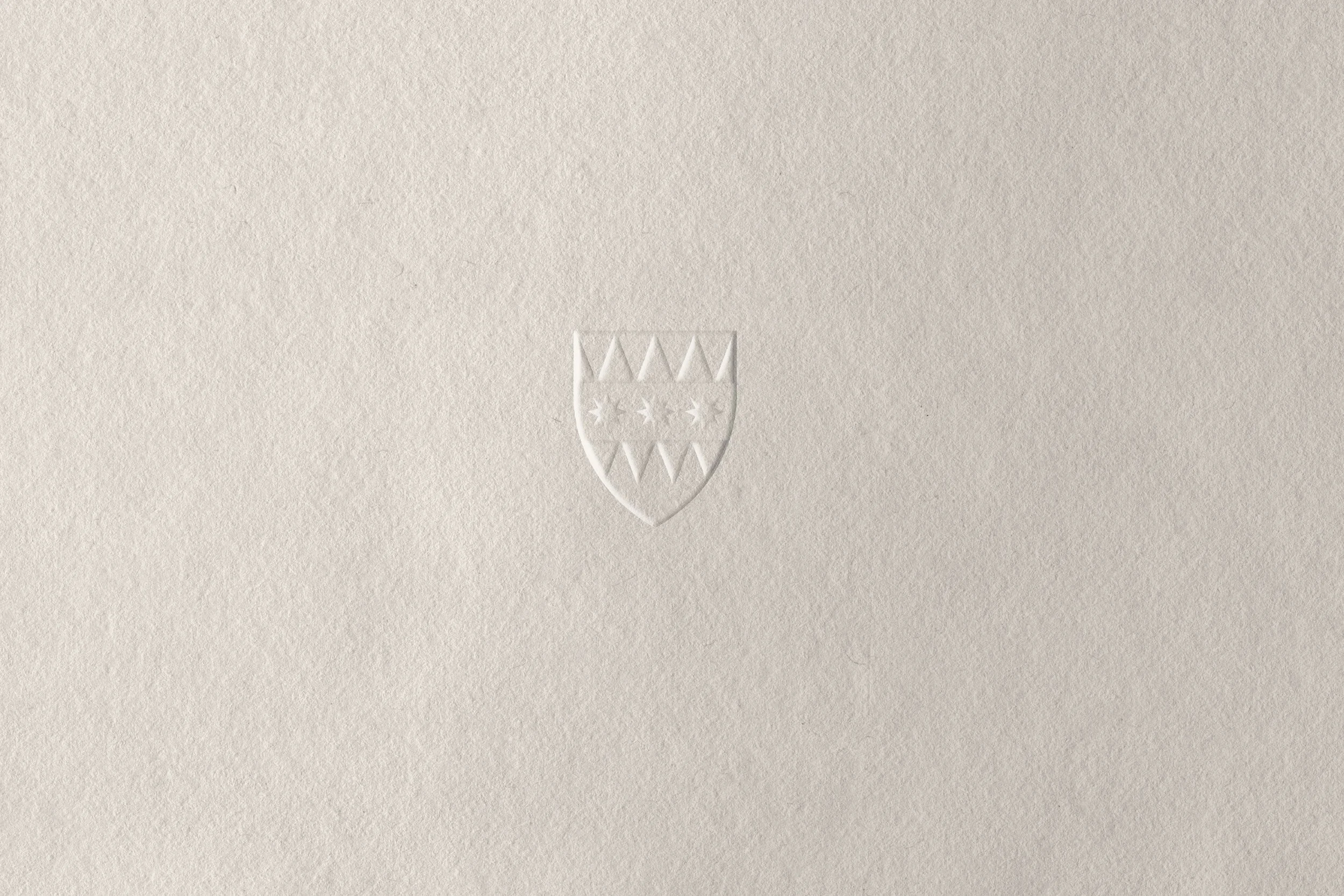

We introduced “the brio” by reimagining the family crest into a modern, refined logo—transforming its original elements into a contemporary expression of their heritage, values, and vision. From the visual language and website to printed materials and printless business cards, every touchpoint was thoughtfully considered to create a cohesive identity that feels personal, connected, and true to the family behind it.
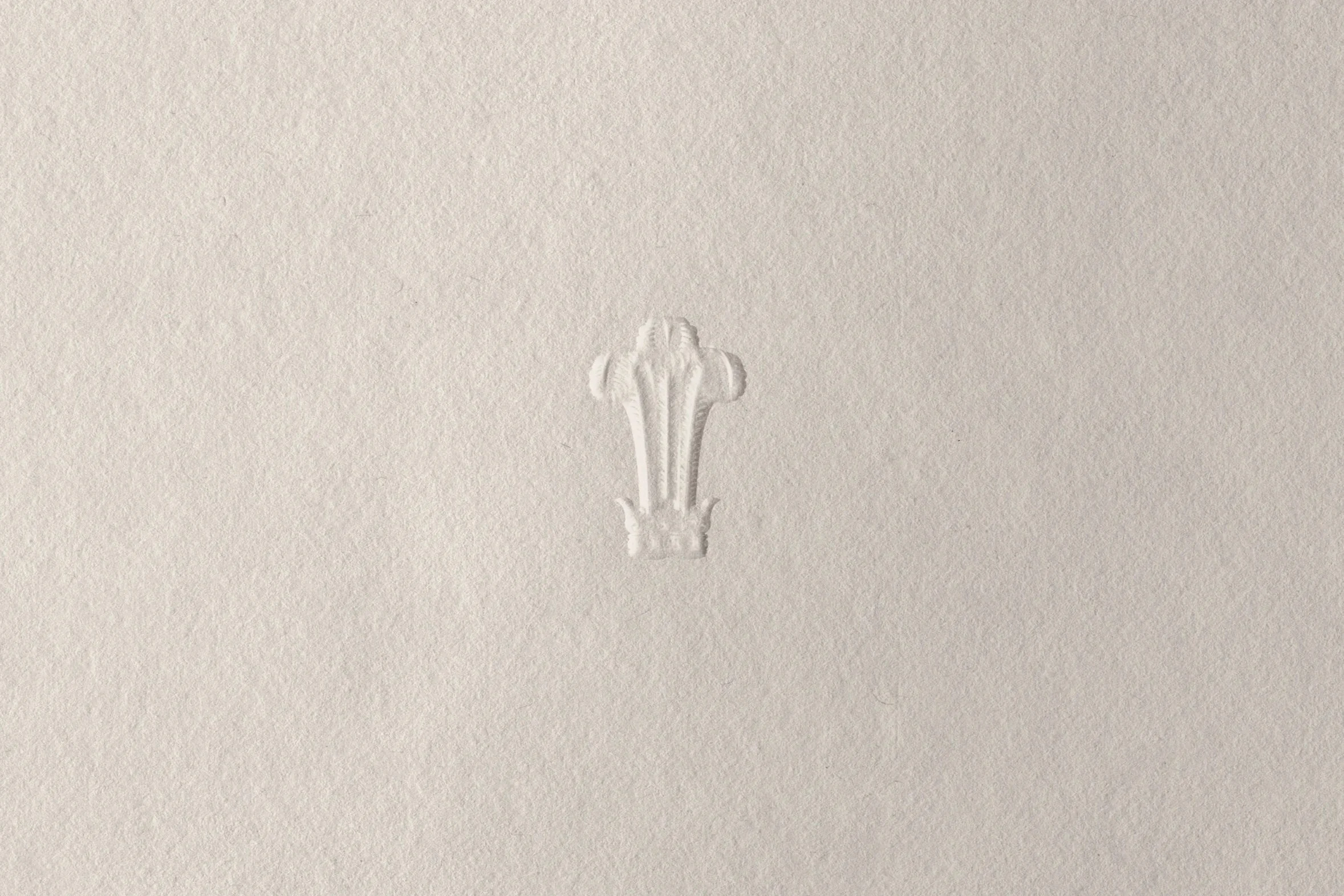
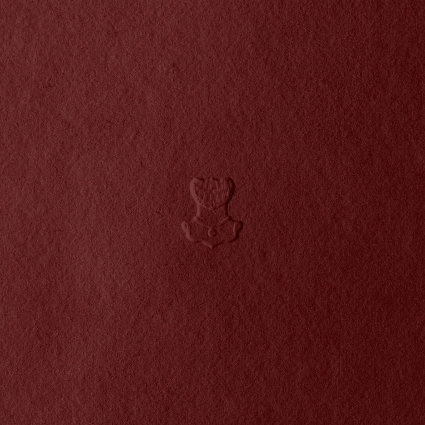
The result is an identity that feels rooted yet forward-looking. A visual presence that connects heritage with intention, personal values with purposeful investment, and the individual projects within a larger family vision.
grounded, personal, and connected.